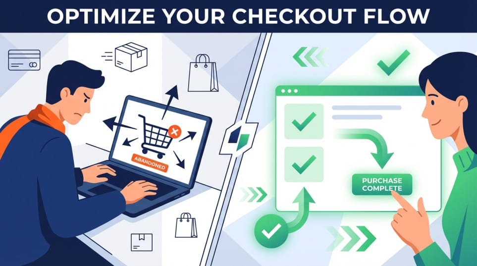
Across online shopping, by the time a shopper reaches checkout, you have already earned their visit and persuaded them to care. But that isn’t always enough to win the sale. Often, online shoppers end up abandoning their shopping cart upon reaching checkout and this remains a significant challenge faced by ecommerce businesses today. When a visitor stalls or leaves behind an abandoned cart, it is usually not about intent. It is about friction, doubt or confusion.
Here is a practical look at the ten of the most common issues that block or slow down checkout most often, and specific ways to address each. We’ve compiled these by observing how experienced retailers (from across the Alhena community) have successfully mitigated the issue of abandoned carts. The focus here is on preventive steps that can be taken to avoid loss of sales and therefore won't delve into post cart abandonment strategy like abandoned cart emails or retargeting.
A simple lens for thinking about checkout friction
Most cart abandonment problems across online shopping fall into one of three buckets:
- Clarity The shopper does not fully understand price, options or what happens next.
- Control The shopper feels boxed in by limited choices in accounts, payments or shipping.
- Confidence The shopper is not yet comfortable with fit, quality, trust or support.
Every issue below falls into one of these three buckets. The way to mitigate abandoners is to reducing the cognitive load, restore a sense of control or add targeted reassurance / incentives at the exact moment doubt surfaces in their minds.
1. Forced account creation and no guest checkout
The problem: Requiring an account before payment is still one of the biggest reasons users abandon their shopping carts. New customers may not yet see the value in “joining” your community, they might just want to complete the purchase. Being pushed into creating a password, confirming email and opting in or out of marketing creates friction and leaves online shoppers frustrated.
How to fix it
- Offer a clear, prominent guest checkout path, above the fold.
- Position account creation as optional and benefit led, for example: “Save your details for next time” or “To track orders and manage returns”.
- Move the password creation process after the first successful order(after the transaction), using a simple one click link in email or on the confirmation page.
- Consider passwordless options such as email or SMS login that do not feel like “registration”.
Account walls can be valuable for loyalty programs, but making them optional at the point of payment tends to reduce cart abandonment without harming long term engagement.
2. Late stage shopping cart price hike, fees and duties
The problem: A sudden surge in the total payable amount at checkout is a big contributor of . Common culprits are shipping fees, taxes, duties, handling charges, platform fees and currency conversions that appear only at the final step. Online shoppers interpret these as a lack of transparency and often abandon to “think about it”, then never return.
How to fix it
- Provide running totals(including shipping costs, taxes or discounts) that update as soon as shipping method, address or currency is selected.
- Show estimated taxes and duties as per the applicable rate for international shoppers, even if the exact amount is finalized at the end.
- Avoid adding “mystery” fees that are not clearly explained in plain language.
- If free shipping or thresholds are part of your model, show progress clearly, for example: “You are 12 dollars away from free shipping”.
The goal is not to be the cheapest, it is to be predictable. Shoppers can work with a higher price. They struggle with a surprise. Fewer surprises equal fewer abandoned carts.
3. Slow or unstable checkout experience
The problem: Even modest delays at the payment step have a strong impact on completion. Pages that lag between steps, spinners that feel endless, card validation errors that take several seconds, or mobile pages that freeze when switching payment methods all undermine confidence.
The real issue is less about patience and more about trust. If the interface feels unreliable, the shopper is reluctant to proceed with the transaction.
How to fix it
- Measure time to interact and time to complete for each step, on real devices and networks, not just in a lab.
- Simply how your ecommerce site runs. Defer non essential scripts, analytics and widgets that load during checkout.
- Use inline validation that responds almost instantly for fields like card number or postal code.
- Test payment flows specifically on older devices and mid range Android phones, which often differ from desktop or flagship performance.
There is no need for perfection in online shopping, all we need to do is optimize the experience to feel responsive and stable from the first click to the confirmation screen.
4. Form friction and unnecessary fields
The problem: Design your online ecommerce store to fit the needs and behavior of today's online shoppers. Long forms, ambiguous labels and fields that do not map to how people think are a quiet but persistent cause of drop off. Common examples are:
- Asking for data you already have from earlier steps.
- Strict formatting on phone numbers or addresses without clear examples.
- Over collecting information for marketing or CRM at the expense of speed.
Shoppers do not mind filling in what is clearly necessary to receive their order. They resist what feels redundant or irrelevant.
How to fix it
- Start with the minimum viable checkout. Only collect what you need for payment, fraud checks, shipping and legal requirements.
- Use address lookup and auto complete where local regulations allow.
- Combine fields where appropriate, for example “First and last name” can sometimes be a single field if it matches your downstream systems.
- Make input expectations visible, using examples or inline hints, instead of relying on error messages after submission.
Ecommerce and retail teams that treat form fields as a product decision, not as a default from their platform, generally see lower cart abandonment.
5. Inflexible shipping and delivery options
The problem: Shoppers often abandon not because shipping is expensive, but because it does not fit their constraints. Long windows with vague estimates, no pickup options or requiring a signature that the customer cannot provide can all stall the decision.
How to fix it
- Offer a small, clear set of shipping options that cover different priorities: cheapest, fastest and most predictable.
- Show realistic delivery estimates with dates, not just ranges, for example “Delivers Thursday 19 December” rather than “3 to 7 days”.
- Where possible, offer pickup points or locker collection, especially in markets where home delivery is less reliable.
- If some items are exceptions, label them early and clearly, not only at the final step.
You do not need every possible shipping configuration. You do need at least one option that feels workable for each major segment of your customer base to minimize cart abandonment.
6. Limited or misaligned payment options
The problem: Checkout can stall on your ecommerce store when the available payment methods do not match the shopper’s habits, behavior or constraints. Examples include:
- No support of popular digital wallets in markets where they are dominant.
- No buy now, pay later option for higher ticket items.
- Forcing manual credit card entry on mobile when digital wallets could autofill.
When shoppers cannot pay in the way they consider safe and convenient, many will postpone their purchase plans and exit.
How to fix it
- Enhance payment options across your top markets and segments. For example, credit cards may be sufficient in some countries, while digital wallets and local bank transfers are critical in others.
- Prioritize mobile friendly methods such as Apple Pay, Google Pay and popular local digital wallets where adoption is strong.
- Respect customer preferences. If a return visitor has used a method before, preselect it when appropriate.
- Keep the number of visible options manageable. Too many choices can create friction, so group or collapse rarely used methods.
- Establish clear trust signals like encryptions, credit card security badges or financial compliance certificates on your payment page.
The objective is not to add every new payment option, but to align with customer behavior so they don't abandon their shopping carts.
7. Poor checkout ergonomics on Mobile Phones
The problem For most ecommerce companies or retailers, mobile traffic often exceeds desktop. But many checkout experiences are still designed primarily with desktop in mind. No doubt a big contributor to cart abandonment. Issues include:
- Tap targets that are too small or too close together.
- Keyboards that do not match the field type.
- Important information placed below lengthy sections or images.
- Modals or popups that are difficult to close on small screens.
Even when everything technically works, a layout that feels cramped or awkward can increase cart abandonment on small devices.
How to fix it
- Design checkout to be mobile first, then scale up to tablet and desktop.
- Trigger the correct keyboard for each field, for example numeric for card numbers and phone, email keyboard for email.
- Keep shopping cart status and order summary visible or easily accessible, so shoppers always know where they are and what they are shopping for on your ecommerce store.
- Regularly test checkout flows on real phones in portrait orientation, not just with responsive design tools.
Mobile checkout does not need to be fancy. It needs to be legible, predictable and thumb friendly so your patrons buy with convenience.
8. Promotion, discounts and pricing confusion
The problem: Discounts that do not apply as expected can undermine the entire purchase and lead to abandoned shopping carts. Examples include cases where:
- Heavy discounts promised in bold marketing campaigns end up having undisclosed limits.
- Promotions end up being limited to a few items in the cart without clear messaging.
- Fields that invite coupons take center stage on the checkout page. Leaving customers feeling they are missing out on discounts if they do not have one.
- Extra discounts are offered to win back lost visitors in abandoned cart emails . This incentives customers to pause before they buy and abandon cart in anticipation of better deals.
Online shoppers who feel they are getting a worse deal than others often pause “to find a better code” and exit.
How to fix it
- Simplify promotion logic and be as explicit as possible, for example “20 percent off all full price items today” instead of complex combinations.
- Validate codes and calculate discounts early in the checkout process and clearly explain why a code does not apply.
- If you must show a coupon field, consider adding neutral copy such as “Optional” and make sure the final price is clearly presented even without a code.
- Ensure marketing, merchandising and engineering teams share a single source of truth for active campaigns and rules.
The aim is to ensure all the promotions run by your ecommerce store are reflected accurately and consistently at checkout. This will undoubtedly reduce cart abandonment.
9. Size and fit hesitation, and how AI agents can help
The problem: In categories like apparel, footwear and accessories, one of the most common reasons shoppers turn abandoners at checkout is very simple: “Will this actually fit me the way I expect?”
Size charts often do not bridge the gap between abstract measurements and real bodies. Your ecommerce store visitors worry about:
- Brand specific fit quirks, such as “runs small” or “relaxed cut”(popular cause of cart abandonment).
- Differences between regions, for example US and EU sizing.
- How an item will fit compared to something they already own and like.
- The hassle of returns if they choose incorrectly.
These concerns frequently surface at the last moment, when shoppers see their chosen size in their shopping cart and begin to second guess themselves.
How AI agents can address this
Modern AI driven fit assistants can reduce this hesitation in practical ways:
- Contextual recommendations The agent can consider height, weight, body shape indicators and age, then combine that with purchase and return data from similar customers to suggest a size with a clear confidence level.
- Brand and product specific guidance Instead of generic advice, the agent can explain that a particular jean “fits snug at the waist and relaxed at the thigh”, or that this sneaker runs half a size smaller than another brand the customer may know.
- Comparison to existing items When shoppers have an account or allow limited data use, the agent can compare measurements to items they have previously bought, for example “Similar fit to the black chinos you ordered in August”.
- Conversational clarification A shopper might ask “I am between medium and large, I like a slightly looser fit, what should I pick?” The agent can understand the user's intent and respond in plain language rather than forcing the customer back into charts and tables.
How to implement this without creating new friction
- Place the AI fit assistant close to size selection and visible in the cart or checkout, not hidden in a separate tool.
- Allow shoppers to ignore it if they prefer, so it adds reassurance rather than becoming a gate.
- Make it clear which data is being used and how, simplify the opt out path.
- Use output that is specific and modest, for example “Most customers like you chose size M and kept it”, rather than absolute guarantees.
AI agents will not eliminate all returns or all concerns. They can, however, provide targeted reassurance at the point of decision, which often reduces both hesitation and post purchase regret. Which means less shopping cart abandonment and improved sales conversion.
Bonus: Tap into conversations of shopping cart abandoners to inform your retargeting efforts and abandoned cart emails
Explore Alhena AI, best performing AI assistant for reducing cart abandonment, here.
10. Weak reassurance on returns, refunds, support and next steps
The problem: Even when price, fit, logistics and shipping costs are acceptable, online shoppers can still hesitate because they are not sure what would happen if something went wrong. Questions online shoppers might have include:
- How easy is it to return or exchange this?
- What if it arrives late or damaged, will their return policy support me?
- Is customer support reachable if there is an issue?
If those answers are buried in a separate return policy page, many shoppers will simply pause and “come back later” instead of proactively seeking out the information.
How to fix it
- Surface return and exchange basics directly in the checkout summary, for example “30 day free returns on unworn items” or “Free exchanges on size”.
- Provide a clear link to the full policy, but lead with a short, human summary.
- Show basic support availability, such as chat hours or response times, and a clear path to contact.
- Keep confirmation emails consistent with what you promised at checkout, so there is no sense of bait and switch.
The goal is to give the shopper enough confidence that if the purchase does not work out perfectly, they will not be stuck.
Bringing it together
Cart abandonment is not a simple problem to solve. But through a collection of small fixes across the customer journey it can be greatly mitigated. The ten issues outlined above need the involvement of more than one team to solve: product, engineering, marketing, finance, logistics and customer service.
A practical approach to executing these fixes and recovering sales is to:
- Prioritize fixes that reduce friction across many orders, such as guest checkout and transparent totals.
- Optimize the customer journey so you can see where and for whom stalls occur.
- Add targeted reassurance where doubt is highest, for example with AI fit agents in size driven categories.
- Treat checkout changes as experiments, with clear hypotheses and outcome metrics. Test how each of your implemented fixes changes shopper behavior and cart abandonment. Change what doesn't work and iterate.
- Supplement these changes with cart abandonment emails and retargeting campaigns.
Most brands that take this methodical approach do not see overnight transformation. They see steady, compounding gains in sale completion, checkout conversion rate and customer confidence. Over time, that is usually what makes the difference between a checkout that feels fragile and one that reliably converts intent into revenue.